ThreeClients,ThreeDesignLanguages
A UNICEF initiative, a consumer health startup, and a Fortune 500 brand. Each required a completely different visual approach.
Fair warning: this one is different. The other case studies here are research-led, with data and before/afters. This work was purely UI and interaction design — three clients, three completely different creative challenges, no shared methodology. What ties them together is execution quality and the ability to adapt to whatever the project demanded.
Role
UI DesignerContract · Freelance
Scope
- End-to-end visual design
- Microsite UI design (UNICEF)
- Icon system (UNICEF)
- Design system (SoundBe)
- Interactive demo tool (SoundBe)
- E-commerce UI (AudioNova)
- Figma prototyping + handoff
TL;DR
- —
UNICEF: Sole designer on a 4-month contract. Translated a Word doc outline into a full microsite and a custom icon system designed to communicate across languages without text.
- —
SoundBe: Built a complete design system and 30+ page e-commerce site from scratch, including a “How Will It Sound?” demo tool — a 4-step Figma prototype designed to let users compare products across 13 real-world sound environments. Sonova acquired Alpaca before it shipped.
- —
AudioNova: When SoundBe was acquired by Sonova, the marketing director brought me onto AudioNova. The challenge flipped: adapt cleanly to an established Fortune 500 brand language rather than invent one.
International Safeguarding Children in Sport
UNICEF UK commissioned a microsite for their International Safeguarding Children in Sport initiative, a global framework helping sporting organizations create safer environments for children. I was brought on via Catchafire (a pro-bono skills marketplace connecting nonprofits with volunteers) as the sole designer: given a Word document outlining the content structure, I was responsible for translating it into a coherent visual experience ready for Figma prototype and developer handoff.
The audience spanned organizations across six continents, many operating in non-English speaking contexts. That constraint shaped every design decision, from information hierarchy to iconography.
Design Decision: Icon System
A purely text-based approach would leave a significant portion of the audience behind. I designed a custom icon set for the eight International Safeguards, giving each a distinct visual identity that communicates independently of language. The icons became the visual backbone of the site, consistent across every page and all printed collateral.

Custom icon set for the eight International Safeguards, designed to communicate across languages without text
200+
Organizations now using the platform globally — per safeinsport.org
6
Continents reached
13
Languages the resources are available in
Homepage: mission statement, 8 safeguards icon grid, dual CTA pathways
Take the Pledge: two organizational pathways, commitment framework
What is Safeguarding: educational content, prevention vs. response framework, abuse type taxonomy
About the International Safeguards: icon grid, safeguard definitions, organizational context
He dealt with our vague requirements with skill, producing a range of amazing icons which were exactly what we were looking for, but he didn't stop there. He also helped us map out a website, which wasn't even in the brief. To say he went above and beyond just doesn't capture the brilliant work he did for us.
Liz Twyford
Sports Programmes Specialist · UNICEF UK
SoundBe → AudioNova
I started as a freelance UI designer for Alpaca, a hearing tech startup building SoundBe: a direct-to-consumer e-commerce platform for hearing aids, accessories, and hearing protection. Working from a creative direction set by the lead creative director, I built the design system and 30+ page designs from the ground up — spanning the entire shopping experience.
When Sonova, a Fortune 500 hearing health company and the parent brand behind Phonak, acquired Alpaca, the SoundBe marketing director brought me onto AudioNova, one of Sonova's retail brands. The design challenge inverted: rather than setting every constraint, I now had to produce work that felt native to a brand I didn't build.
SoundBe: Built from Scratch
Consumer startup. Vibrant blue-to-purple gradient identity, lifestyle-driven browsing (shop by activity: Sports, Kids, Travel, Sleep), and a full design system covering color, typography, components, and interaction states.
AudioNova: Adapted to Brand
Fortune 500 enterprise. Premium dark-green identity, photography-led layouts, and a restrained UI vocabulary. The work was about fluency in someone else's visual language: not introducing new ideas, but executing existing ones with precision.
SoundBe
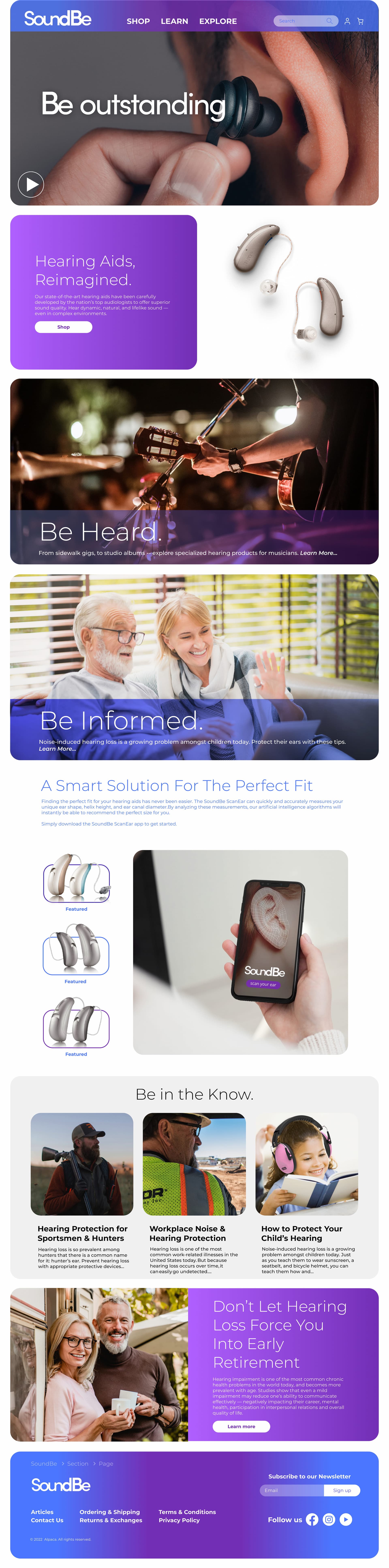
Homepage: brand identity, hero carousel, product entry points
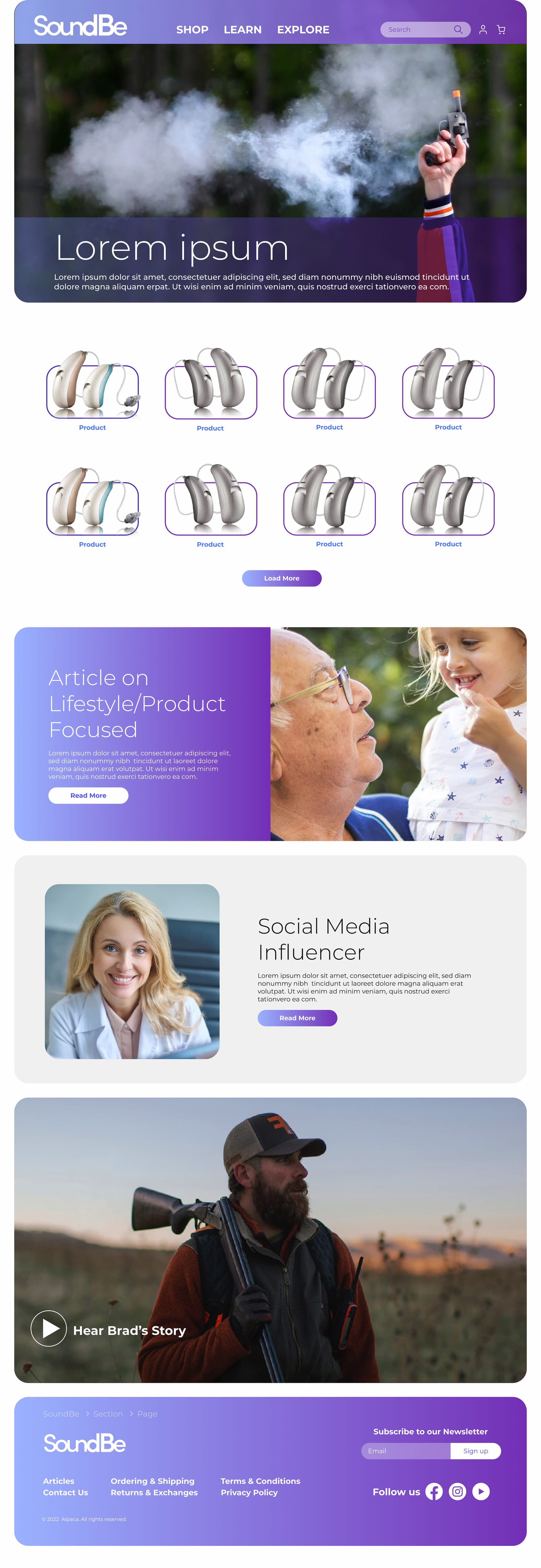
Explore by lifestyle: browse hearing products by activity rather than product category
Design Challenge: Product Discovery
Hearing protection is a sensory product. A user shopping for earplugs online can't physically try them before buying. The challenge: how do you communicate the core value proposition — how it actually sounds — through a screen?
“How Will It Sound?” Interactive Demo Tool
I designed and prototyped a 4-step interactive tool that would let users hear how SoundBe earplugs compare to foam plugs and earmuffs across 13 real-world environments — from dance venues to construction sites to hotel rooms. Each environment surfaces a different set of relevant products. Each product card plays an audio demo and can be flipped to reveal a detailed sound description alongside a direct shop link. The tool was fully prototyped in Figma and presented to the client; Sonova's acquisition of Alpaca meant it was never built.
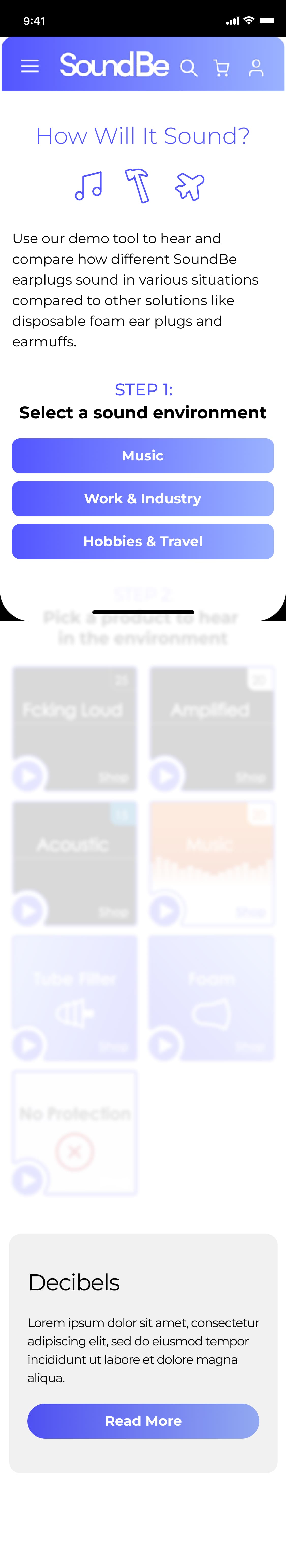
Step 1: User selects a sound environment — Music, Work & Industry, or Hobbies & Travel.
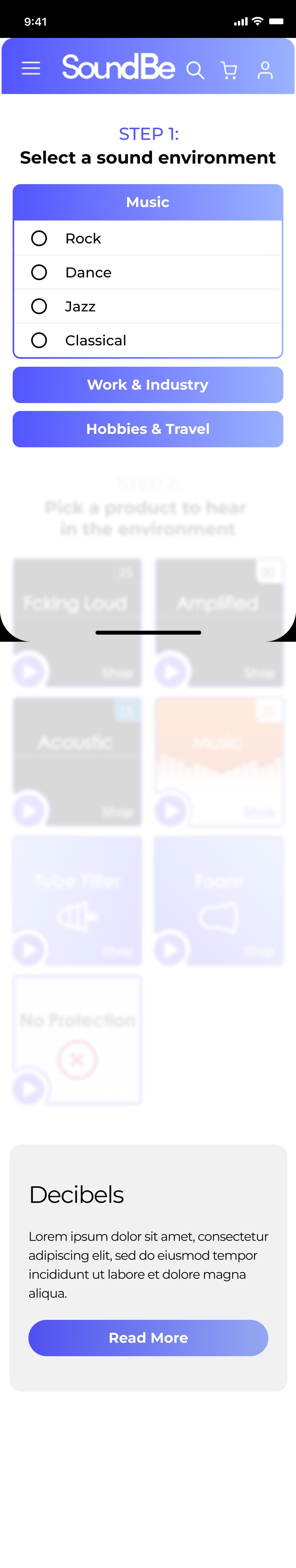
Step 2: The selected environment expands to reveal specific scenarios. Music surfaces Rock, Dance, Jazz, and Classical.
Interactive Prototype
Interaction Design
- —Accordion dropdowns for top-level environment selection, radio buttons for subcategory
- —Contextual product grid: 13 environments × multiple products, each combination designed individually
- —Card flip animation: front shows product name, dB level, and audio play button; back reveals detailed sound description
- —Direct shop links on both sides of every card
Design System
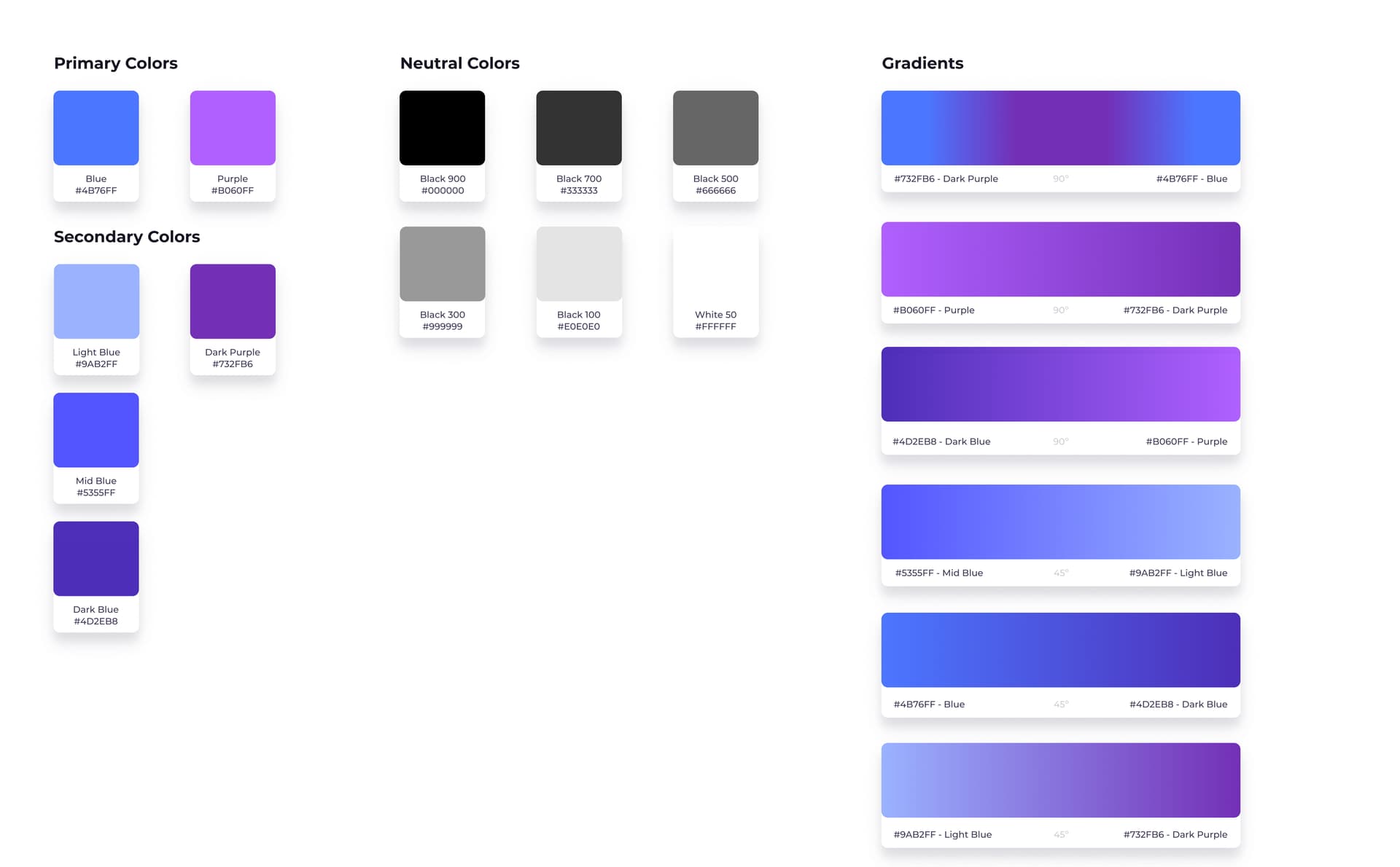
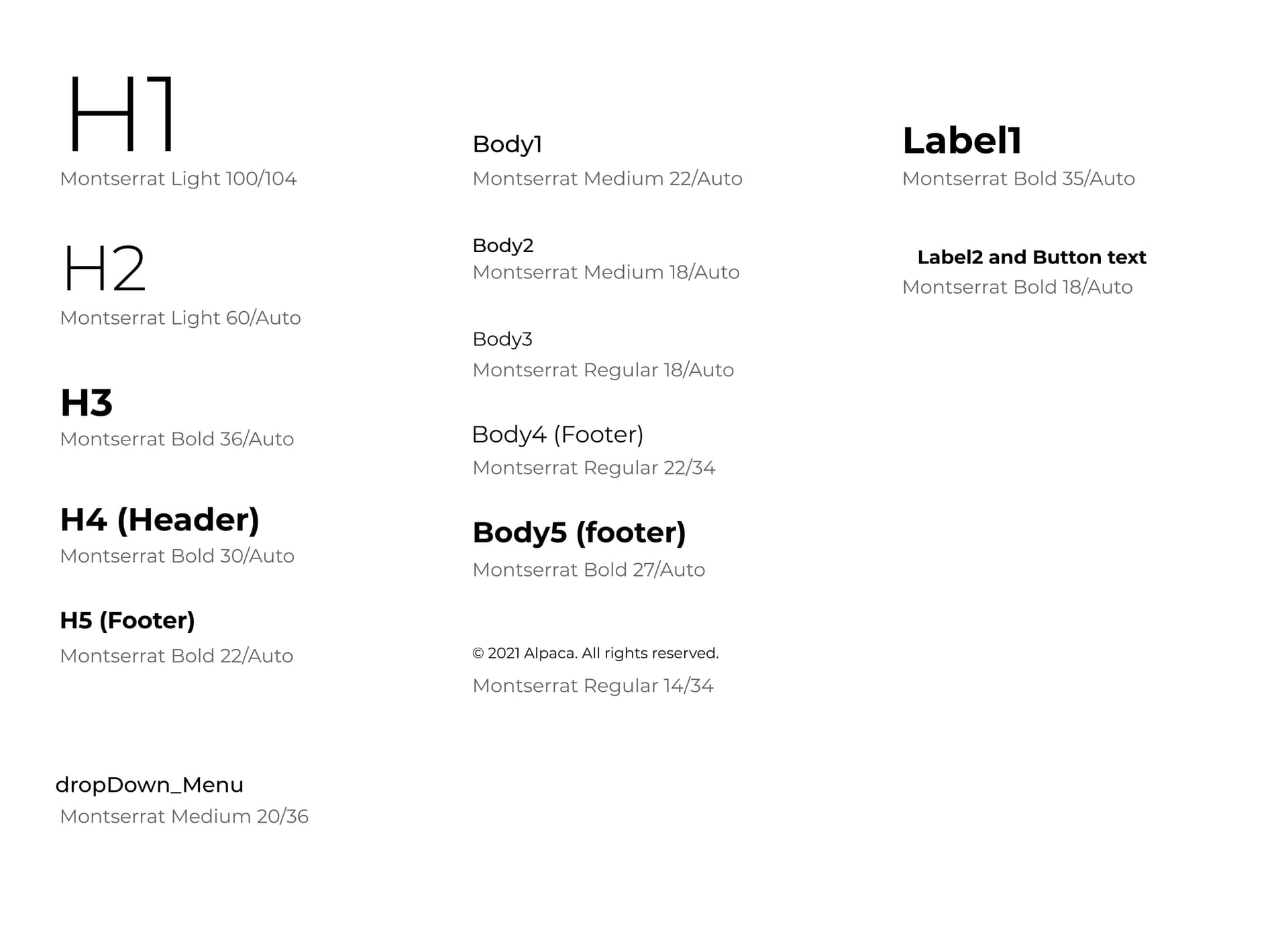
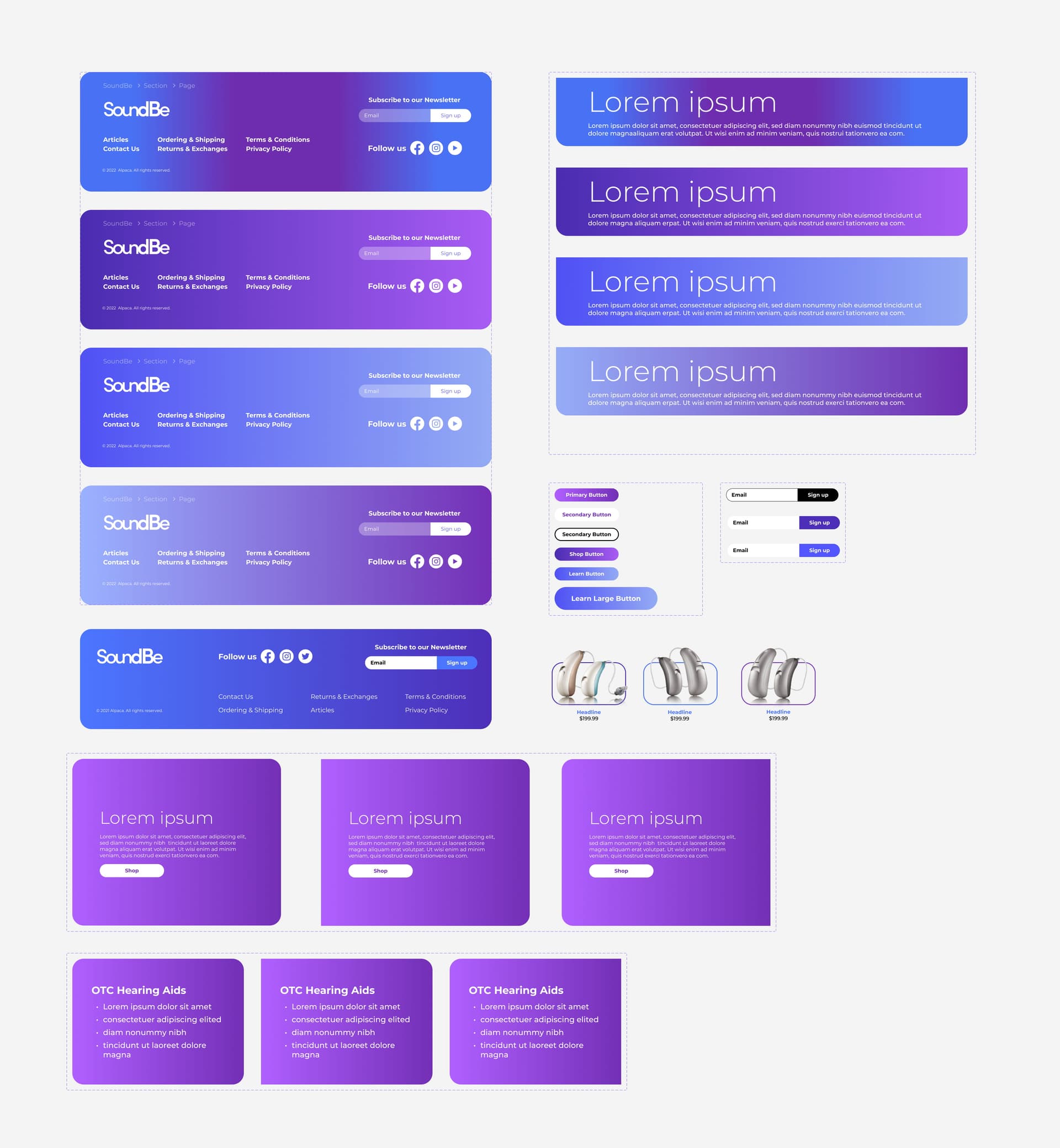
Color palette with gradient system, type scale, and card components — all built as a reusable Figma library for the development team.
Interactive Prototype — SoundBe
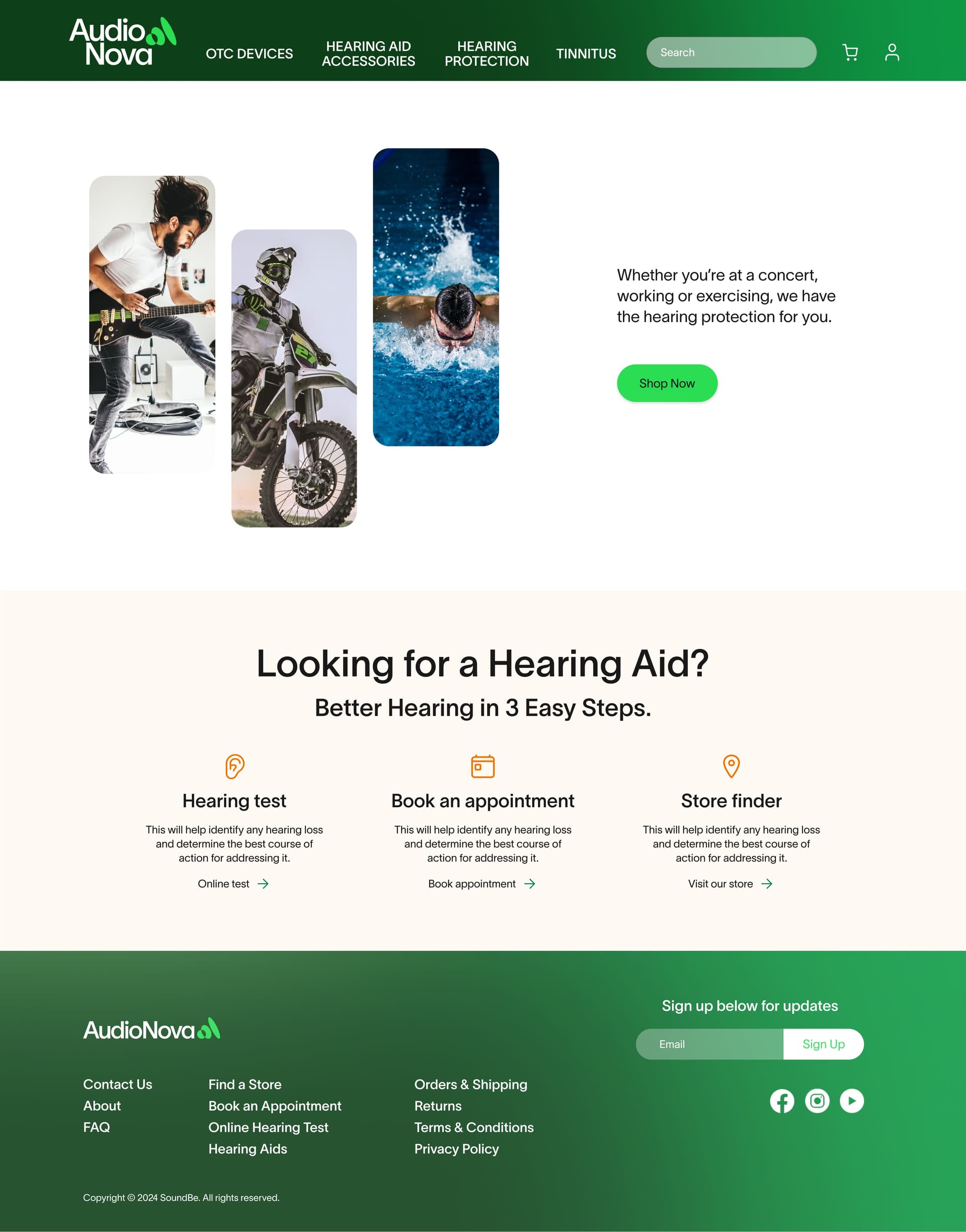
AudioNova
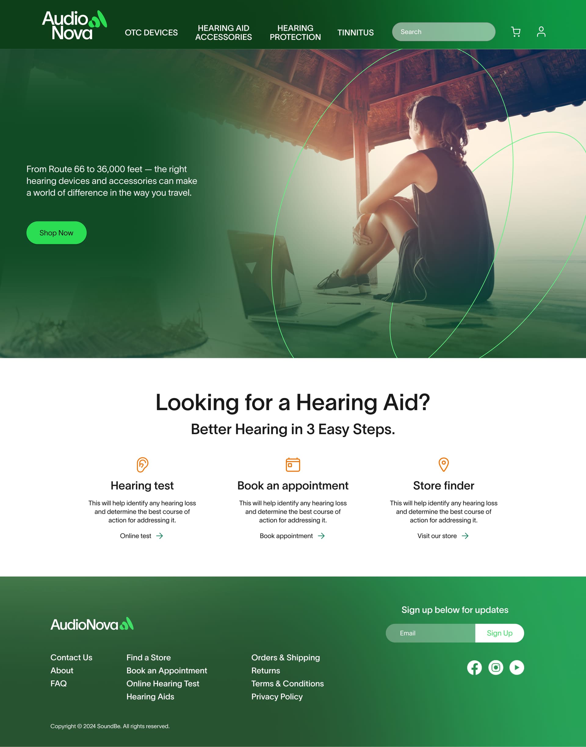
Landing page: 3-step hearing journey, store finder, premium brand language
Landing page v2: alternate layout direction explored before the final version was confirmed
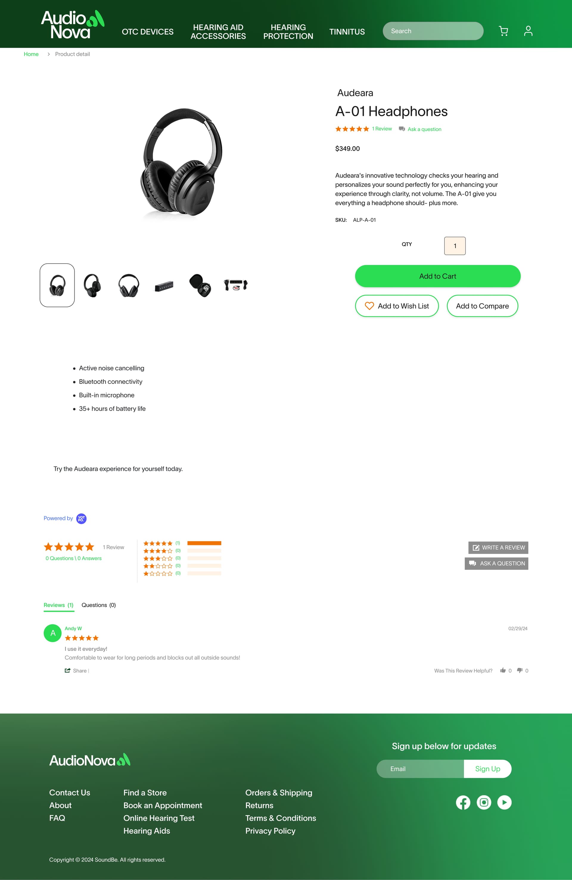
Product detail: gallery, specs, add-to-cart, reviews
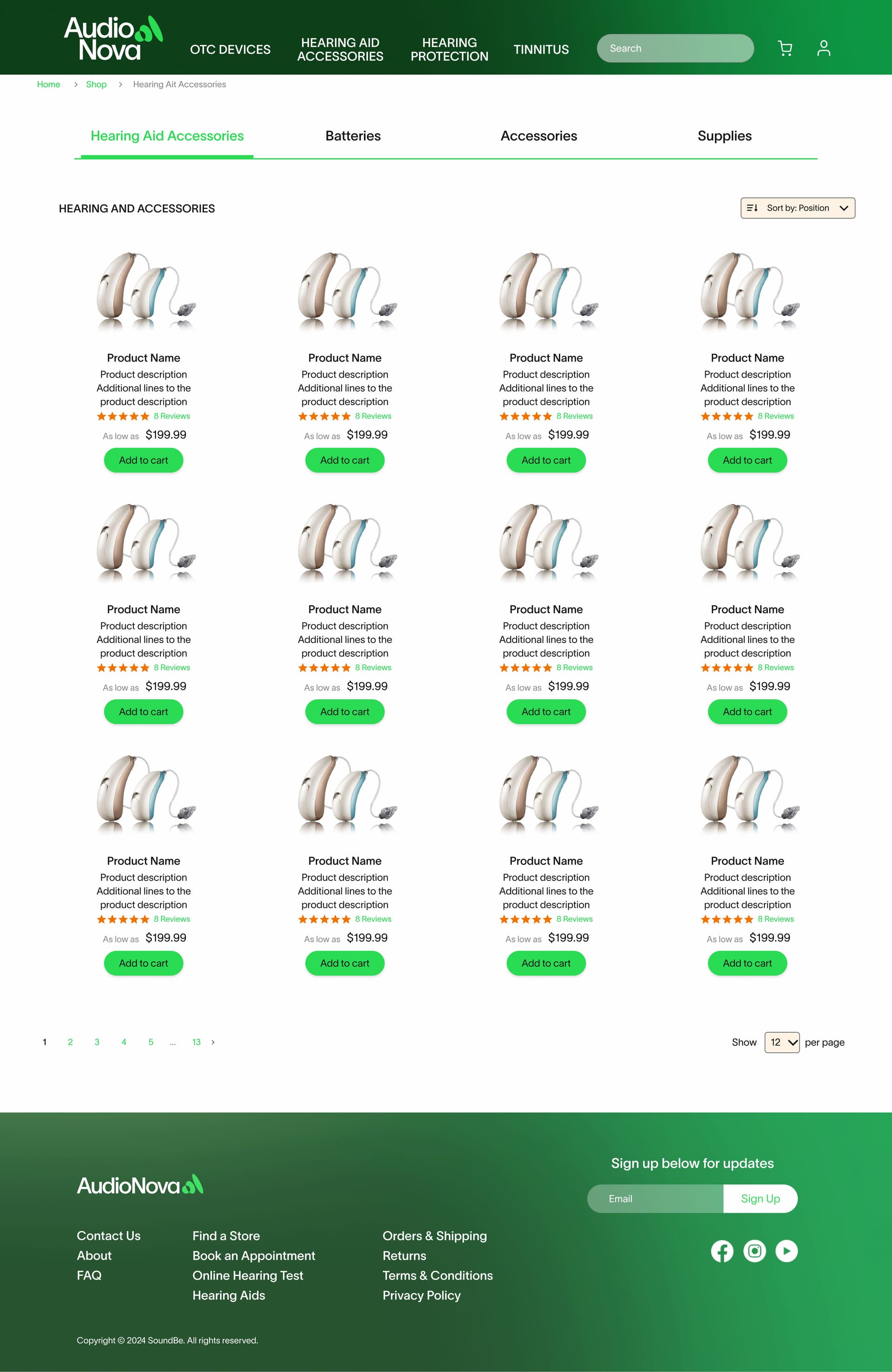
Category page: accessories browsing within the AudioNova brand system
Reflection
These three projects cover a lot of ground — a UNICEF initiative designed for non-English-speaking audiences, a direct-to-consumer startup built from scratch, and a Fortune 500 brand where the job was fluency, not invention. What they share is that each one required a different version of the same skill: reading a context you didn't create, understanding its constraints, and producing work that fits.
The SoundBe work is where I most clearly see the distance between designing screens and designing an experience. The “How Will It Sound?” tool came out of a specific problem: hearing protection is a sensory product, and an e-commerce page can't simulate what foam in your ears actually sounds like. Solving it required thinking through a 4-step decision flow, a 13-environment content model, card interaction logic, and a Figma prototype detailed enough to present and walk through with the client. It didn't ship — Sonova acquired Alpaca before development started — but the design problem was real and the solution was complete.
If I could go back on the UNICEF project, I would have pushed for more rounds of review with someone on the ground in a non-English-speaking context. The icon system was designed to communicate without language, but it was validated primarily by an English-speaking team. That's a gap worth closing.